alexleclerc.github.io
Homework 1 (CS460)
For the first homework we were asked to learn the basics of HTML and CSS, using git from the command line, and using Bootstrap for the layout. Luckily, I had some previous experience with HTML, CSS, and GitHub.
I was unfamiliar with Bootstrap and the command line version of git, so I spent the most time figuring out how to make a nice layout with Bootstrap.
I wanted to make something that I could use later, and decided on the layout for a portfolio style website to hold my personal info (resume and whatnot), my developer information, and my two different genres of art work. Eventually I scaled the concept down to developing only one of these sections.
1: Git Set-up
Over the summer I made a GitHub account and used the GitHub GUI, but I hadn’t used the command line version so I had to download that from Git-scm.
I am on a windows machine, but only use the Windows Command line when forced to, so I use the Git Bash with Linux commands.
git init
git add .
git commit -m "First commit."
I accidently did this the hard way, by starting my project in a local repository and then having to set the Remote repository and link the two. I used the documentation on this page as a guide.
git remote add origin https://github.com/alexleclerc/CS460.git
git -v
origin  https://github.com/alexleclerc/CS460.git (fetch)
origin  https://github.com/alexleclerc/CS460.git (push)
Later I made my remote repositories on github and just cloned them on my machine.
2: Webpage
I had made HTML websites styled with CSS over the summer, so I had no trouble with that. However I did not know where to begin with Bootstrap (though I wish I had, would have saved so much time!) so I turned to two places: Bootstrap getting started website and W3Schools Bootstrap tutorial and Bucky Roberts (aka thenewboston’s) tutorials on youtube.
I started out with the ‘Hello World’ template from Bootstrap’s website, did some reading and started planning.
I mulled over what to do with my webpage for longer than I should have. I wanted something that I could use later. I drew out some ideas on dot grid paper.
I started out thinking too big, with a website with 4 sections that each functioned as their own little website…
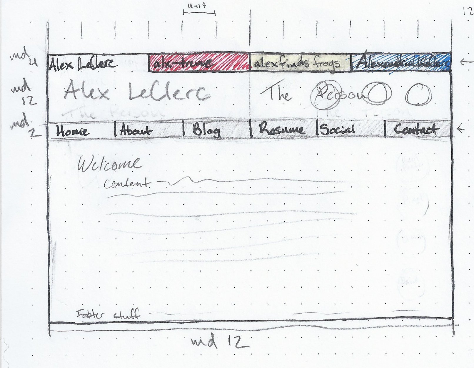
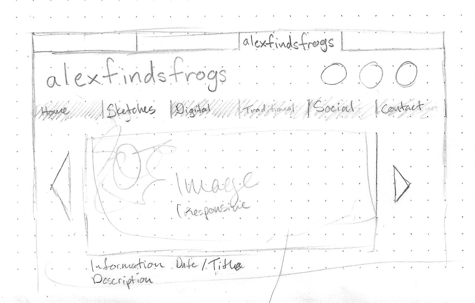
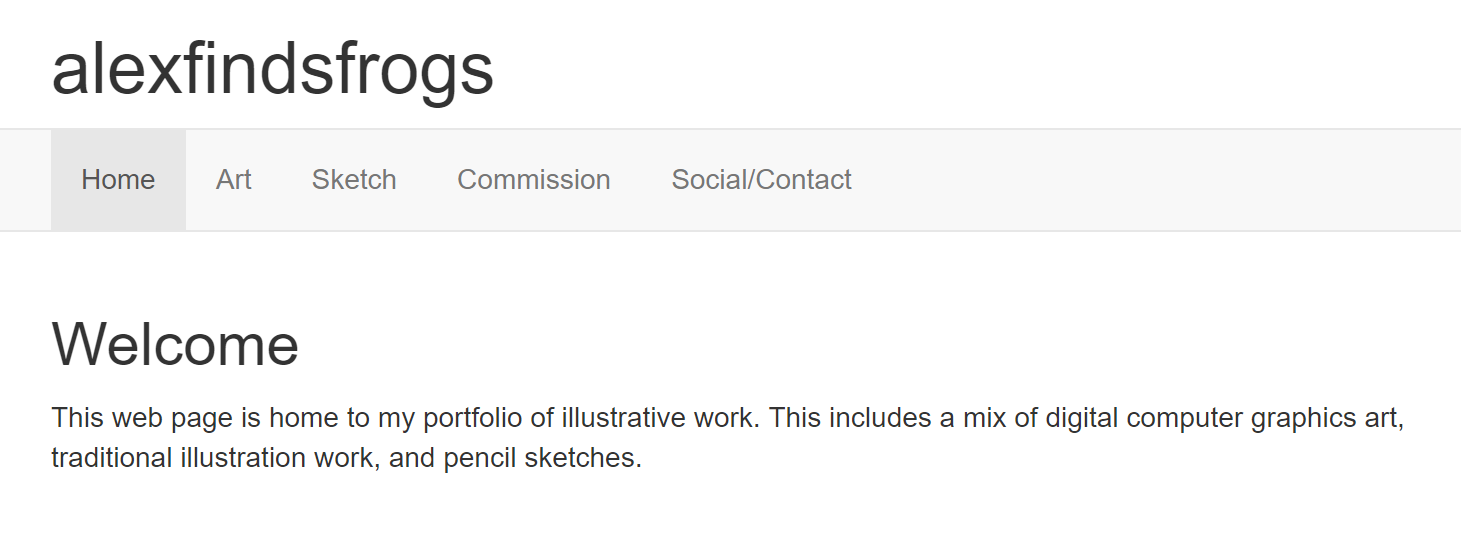
I realized I didn’t have time for that so I chose to focus on the page that I would have the easiest time making and would fit all of the homework requirements. I decided on the illustration page (alexfindsfrogs).
2.1 Bootstrap & Navbar
With a plan in place I made the HTML structure for all of the pages, and made the navigation bar with the proper links:
<!DOCTYPE html>
<!--The landing page of my art website. In the future this will probably have an about section and such.-->
<html lang="en">
  <head>
    <title>alexfindsfrogs</title>
    <!-- Required meta tags -->
    <meta charset="utf-8">
    <meta name="viewport" content="width=device-width, initial-scale=1">

    <!--Bootstrap CSS-->
    <link rel="stylesheet" href="https://maxcdn.bootstrapcdn.com/bootstrap/3.3.7/css/bootstrap.min.css">
    <script src="https://ajax.googleapis.com/ajax/libs/jquery/3.2.1/jquery.min.js"></script>
    <script src="https://maxcdn.bootstrapcdn.com/bootstrap/3.3.7/js/bootstrap.min.js"></script>


  </head>

  <body>
    <div class="container" id="banner">
        <h1>alexfindsfrogs</h1>
    </div>

    <div id="nav-wrapper">
        <nav class="navbar navbar-default">
            <div class="container">
                <ul class="nav navbar-nav">
                    <li class="active"><a href="./hw1-1-home.html">Home</a></li>
                    <li><a href="./hw1-2-digital.html">Art</a></li>
                    <li><a href="./hw1-3-sketch.html">Sketch</a></li>
                    <li><a href="./hw1-4-commission.html">Commission</a></li>
                    <li><a href="./hw1-5-social.html">Social/Contact</a></li>
                </ul>
            </div>
        </nav>
    </div>

    <div class="container" id="content">
        <h2>Welcome</h2>
            <p>This web page is home to my portfolio of illustrative work. This includes a mix of digital computer graphics art, traditional illustration work, and pencil sketches.</p>
    </div>
  </body>
</html>
2.2 Multi-Column Layout, Lists, and Table
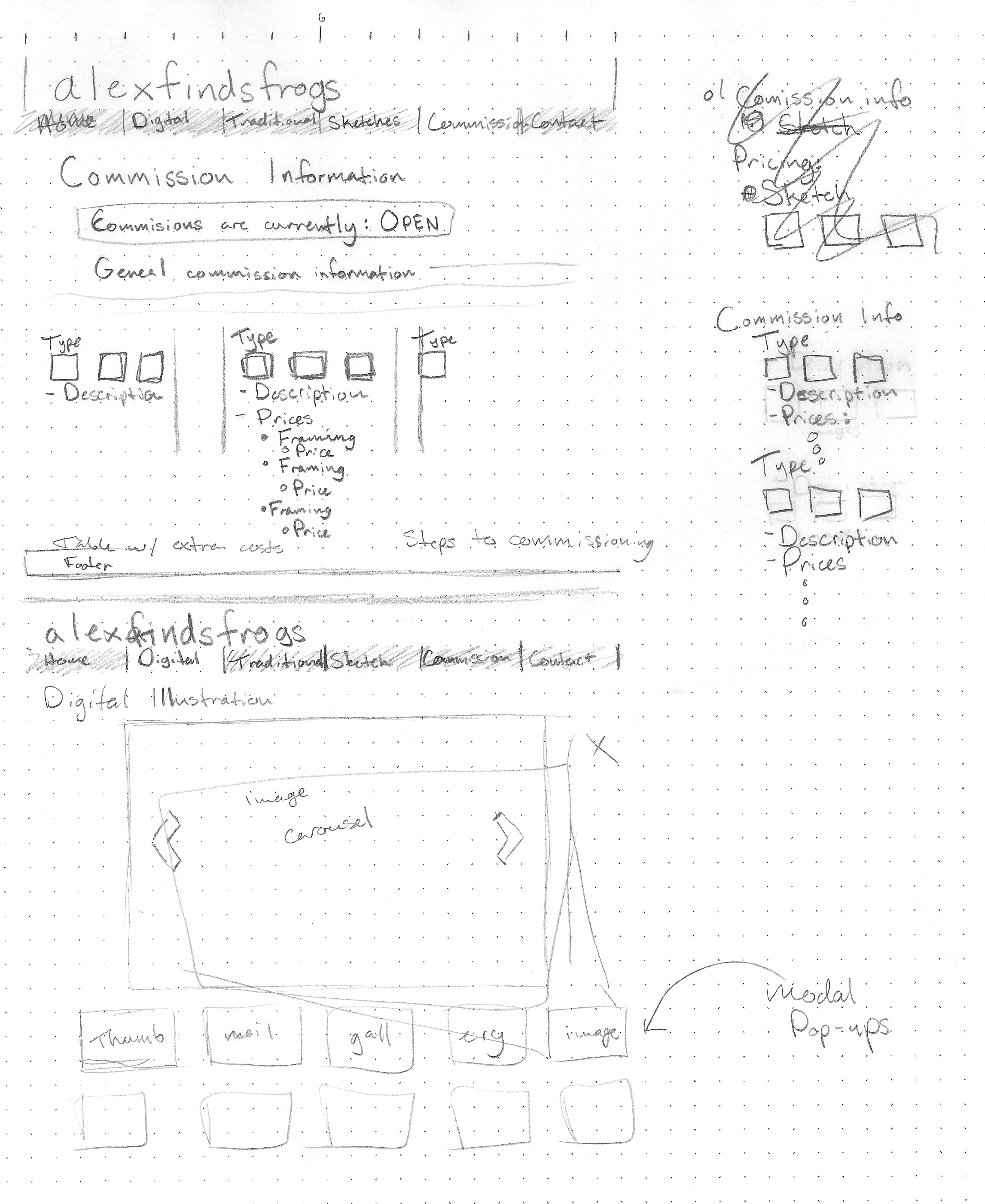
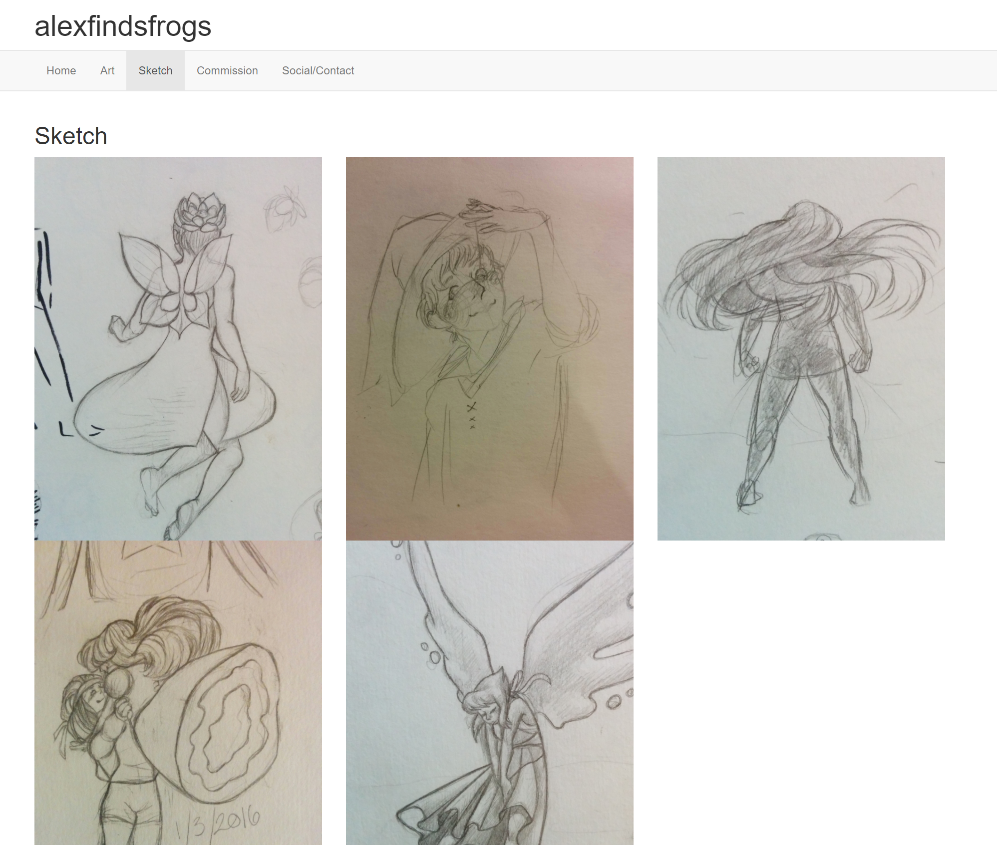
The ‘Sketch’, ‘Commission’, and ‘Contact’ pages is where I met most of the requirements for the homework.
The Sketch page met the multi-column requirement:
<div class="row">
    <div class="col-md-4">
        <img class="img-responsive" src="images/sketch1.jpg" alt="Lotus Fairy">
    </div>

    <div class="col-md-4">
        <img class="img-responsive" src="images/sketch2.jpg" alt="Witch Boy" >
    </div>

    <div class="col-md-4">
      <img class="img-responsive" src="images/sketch3.jpg" alt="Fire">
    </div>
</div>

<div class="row">
    <div class="col-md-4">
        <img class="img-responsive" src="images/sketch4.jpg" alt="Lotus Fairy">
    </div>

    <div class="col-md-4">
        <img class="img-responsive" src="images/sketch5.jpg" alt="Witch Boy" >
    </div>
</div>
(The alt text for the last two images isn’t correct but I fixed it sometime later.)
Commission page took care of the list requirement, (and also uses multi-column layout.)
<div class="row">
    <div class="col-md-4">
        <dl>
            <dt>Sketch</dt>
            <dd>-A pencil drawing with some shading and detail.</dd>
            <dd>-Prices
                <ul>
                    <li>Bust - $15</li>
                    <li>Waist-up - $25</li>
                    <li>Full body - $40</li>
                </ul>
            </dd>
        </dl>
    </div>

    <div class="col-md-4">
         <dl>
            <dt>Line art/Flat Color</dt>
            <dd>- Digital illustration with lines and optional flat colors.</dd>
            <dd>- Prices
                <ul>
                    <li>Bust - $25</li>
                    <li>Waist-up - $35</li>
                    <li>Full Body - $50</li>
                </ul>
            </dd>
        </dl>
    </div>

    <div class="col-md-4">
        <dl>
            <dt>Full Illustration</dt>
            <dd>-A fully finished illustration with shading and simple backgrounds.</dd>
            <dd>
                <ul>
                    <li>Bust - $40</li>
                    <li>Waist-up - $55</li>
                    <li>Full Body - $75</li>
                </ul>
            </dd>
        </dl>
    </div>
</div>
<div class="row">
    <div class="col-md-12">
        <h4><em>The fine print</em></h4>
            <ol type="I">
                <li>
                    The above prices don't account for extra people, elaborate props, or complicated backgrounds/environments. Usually these need to be quoted separately. These extra items can be addressed during intial pricing of a commission request.
                </li>
                <li>
                    Half of payment is due when the commission is started as a deposit, the other half  is due at completion. If I am unable to complete the commissioned work and choose to cancel it, then a refund will occur. If a client cancels a commission after I have already started it, deposit refunds are not guranteed.
                </li>
                <li>
                    Progress updates will be provided through the course of the illustration and feedback is welcome. Major adjustments close to completion may require a change order fee.
                </li>
            </ol>
    </div>
</div>
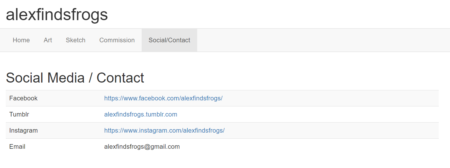
And lastly I had a table for the social media / contact page.
<table class="table table-striped">
   <tbody>
       <tr>
           <td>Facebook</td>
           <td><a href="https://www.facebook.com/alexfindsfrogs/">https://www.facebook.com/alexfindsfrogs/</a></td>
       </tr>
       <tr>
           <td>Tumblr</td>
           <td><a href="alexfindsfrogs.tumblr.com">alexfindsfrogs.tumblr.com</a></td>
       </tr>
       <tr>
           <td>Instagram</td>
           <td><a href="https://www.instagram.com/alexfindsfrogs/">https://www.instagram.com/alexfindsfrogs/</a></td>
       </tr>
       <tr>
           <td>Email</td>
           <td>alexfindsfrogs@gmail.com</td>
       </tr>
   </tbody>
</table>
3. CSS Styling
If I ever get around to making the larger portfolio page, I wanted to keep the Red/Yellow/Blue color scheme, so this page uses yellow as the main color in anticipation of that later.
I also like to use pretty fonts on all of my design projects with text, and I found Google’s Font API, which has a great library of fonts. I liked Autor One and Nunito.
Normally if they are used internally in the HTML file, you would use:
<link rel="stylesheet" href="https://fonts.googleapis.com/css?family=Autour+One|Nunito">
But I didn’t want to mess with another style sheet so I just included the fonts in the top of my .css file like so:
@import url('https://fonts.googleapis.com/css?family=Autour+One|Nunito');
My css was pretty simple, I styled some of the given elements:
body{
    background-color: #fffb50;
    font-family: "Nunito", sans-serif;
    color: #474447;
}

 h1, h2{
    font-family: "Autour One", sans-serif;
    font-weight: bold;
}
I had some trouble styling the navbar. There are a lot of layers to the Bootstrap navbar. This stackoverflow post and Chrome’s developer tools helped me figure out what Bootstrap classes I needed to target in order to override the styling:
.navbar{
    margin-bottom: 0px;
    border: none;
    background-color: #474447;
}

.nav-default{
    background-color: #fffb50;
}

.navbar-default .navbar-nav>li>a {
    color: #FFFFFF;
}
.navbar-default .navbar-nav > li > a:hover,
.navbar-default .navbar-nav > li > a:focus {
    color: #FFFFFF;
}
I added my own divs to give the site different sections to style:
#banner{
    background-color: #fffb50;
}

.pagebackground{
    background-image: url("images/frogtile.png");
}

.content{
    padding-left: 20px;
    padding-right: 20px;
    padding-top: 5px;
    padding-bottom: 10px;
    background-color: white;
    border-radius: 10px;
    margin: 20px;
}
I used an ID for the banner (the title header above the navbar) so I could target it individually. pagebackground and content could refer to sections on the page that all served the same purpose (a styled container) so I left them as classes.
4. The Cutting Room Floor…
Bootstrap has an easy way to make an ‘image carousel’ (a slideshow) and I really wanted to implement it because it shows up a lot on art portfolio websites. I read about it on W3Schools and tried to use it:
<div id="digCarousel" class="carousel slide" data-ride="carousel">

    <!-- Wrapper for slides -->
    <div class="carousel-inner">
      <div class="item active">
        <img class="carouselImg" src="images/45.png" alt="Miraculous Ladybug">
      </div>

      <div class="item">
        <img class="carouselImg" src="images/10.jpg" alt="Witch">
      </div>

      <div class="item">
        <img class="carouselImg" src="images/12.png" alt="Suburban">
      </div>

      <div class="item">
        <img class="carouselImg" src="images/46.png" alt="Princess Leia">
      </div>
    </div>

    <!-- Left and right controls -->
    <a class="left carousel-control" href="#digCarousel" data-slide="prev">
      <span class="glyphicon glyphicon-chevron-left"></span>
      <span class="sr-only">Previous</span>
    </a>
    <a class="right carousel-control" href="#digCarousel" data-slide="next">
      <span class="glyphicon glyphicon-chevron-right"></span>
      <span class="sr-only">Next</span>
    </a>
</div>
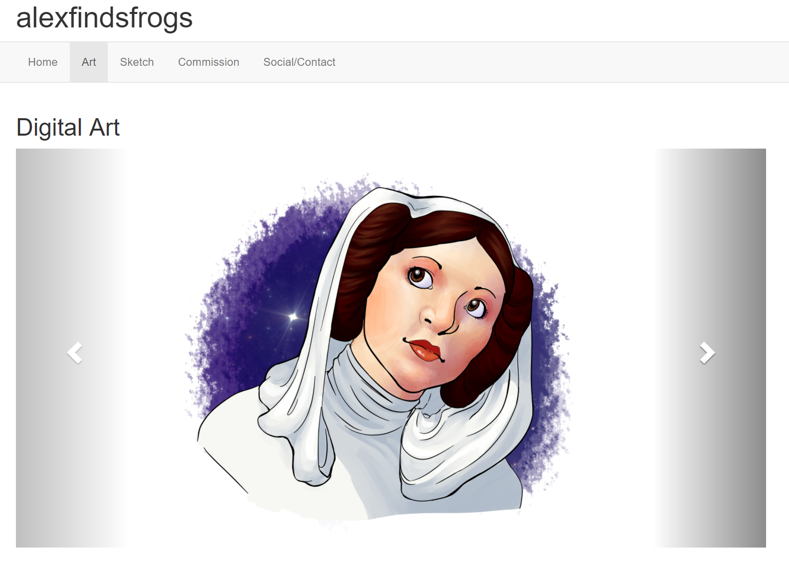
However, the carousel is made with the assumption that all of the images are the same dimensions, or at least the same aspect ratio (like photographs that are all 4:3). My images weren’t like that.
I tried to make it work, (and wasted a bunch of time doing so), before scrapping it and just making it the same as the sketch page.